Create a Responsive Product Landing Page with Manus AI
Hello creators, welcome back to A2SET’s AI Tutorial.
You may already have a product image ready, but creating a landing page from scratch can still feel difficult.
You need to write copy, arrange the product visual, place the CTA, organize sections, and make sure the page works well on both desktop and mobile.
In this tutorial, we will use Manus AI’s Free plan to turn one product image and a short product brief into a responsive one-page landing page.
The goal is not to build a complete ecommerce store.
We are creating a landing page prototype that introduces a product clearly and gives a brand team something visual to review.
There will be no checkout, login, order system, or customer database.

Image caption: Manus can turn one product image and a short brief into a responsive landing page preview for desktop and mobile.
Step 1: Check That Manus 1.6 Lite Is Selected
On the Manus home screen, look at the model selector in the top-left corner.
For the Free plan, make sure Manus 1.6 Lite is selected.
When you open the menu, Manus 1.6 Max and Manus 1.6 may show a Pro badge, while Manus 1.6 Lite is presented as the lightweight option for everyday tasks.
For this tutorial, we are only creating a simple one-page product landing page, so Manus 1.6 Lite is enough to begin.
You can also check your available credit balance in the top-right corner before starting.
Step 2: Start with Build Website and Upload Your Product Image
Below the main prompt box, you will see shortcut buttons such as Create slides, Build website, Develop desktop apps, and Design.
For this tutorial, select Build website.
This makes it clear that you want Manus to create a web page rather than a document or app.
Next, click the + button inside the prompt area and upload your product image.
For the best result, use a clear front-facing or 45-degree product shot.
The package shape, label, color, and material should be easy to see.
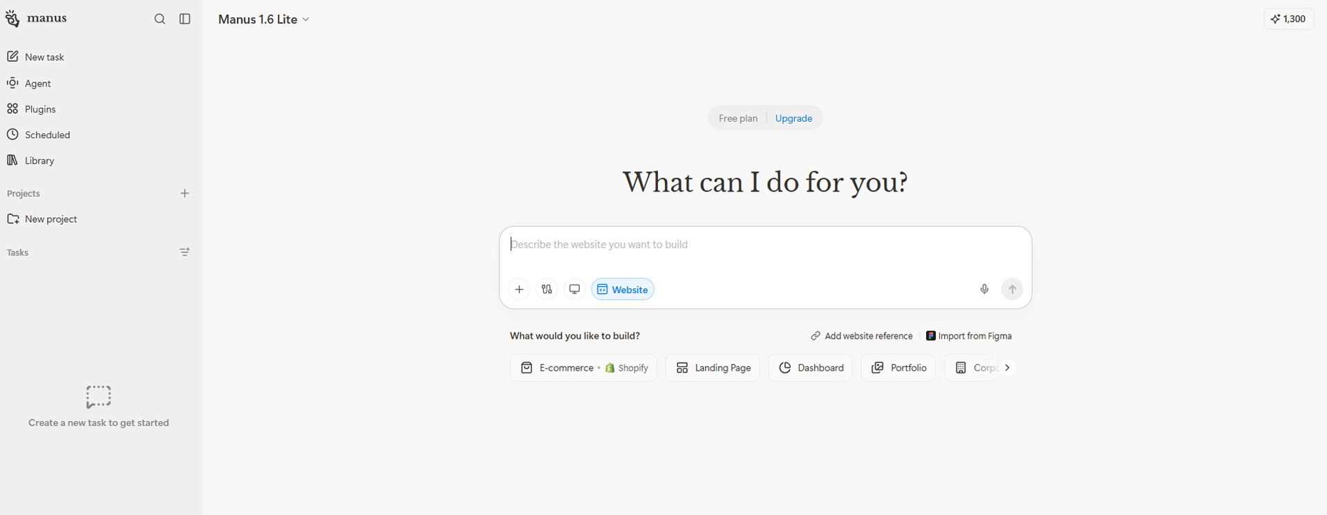
Image caption: Choose Build website, then upload one clear product image with the plus button.
Step 3: Ask Manus to Create a Responsive One-Page Landing Page
Once the image is uploaded, use the prompt below.
Replace the bracketed parts with your real product information.
Prompt to use:
Create a responsive one-page product landing page prototype based on the uploaded product image.
Product name:
The most important part of this prompt is the responsive requirement.
By clearly requesting both desktop and mobile layouts from the beginning, you will have a stronger page to review and refine later.

Image caption: Tell Manus that the page should work clearly on both desktop and mobile from the first prompt.
Step 4: Review the Desktop and Mobile Preview
After Manus creates the page, you will see a browser-style preview.
In the top-left corner of the preview, there are icons for switching between desktop and mobile views.
Start with the desktop view.
Check whether the product image and text area feel balanced, whether the product is visible enough, and whether the CTA button is easy to notice.
Then click the mobile icon.
In mobile view, check whether the product image is cropped, whether the text is too long, and whether the CTA appears early enough without excessive scrolling.
You are not creating two separate websites.
You are checking how one responsive page adapts across different screen sizes.
Image caption: Switch between desktop and mobile preview modes to review the same landing page responsively.
Step 5: Review the First Result Before Editing
Do not rebuild the page immediately after seeing the first result.
Instead, review these points on both desktop and mobile.
On desktop:
Is the product image large enough?
Does the page explain what the product is within a few seconds?
Is the CTA placed where users can easily notice it?
Does the text and product image feel balanced?
On mobile:
Is the product image fully visible?
Is the text easy to read?
Does the first screen feel too crowded?
Can users see the key message or CTA without scrolling too far?
Also check whether Manus added unsupported claims, invented product information, or details that do not match your real product.
Step 6: Refine the Landing Page with Follow-Up Prompts
In the preview area, you may see an Edit button in the top-right corner.
You can enter editing mode there or continue the existing task conversation and ask Manus to refine the page.
For example, if the product is too small or the mobile page feels crowded, use this prompt.
Prompt to use:
Separating desktop and mobile instructions like this helps prevent one layout from improving while the other becomes worse.
Step 7: Refine the Copy and Brand Tone
The layout may look good, but the copy can still feel generic.
In that case, keep the design structure and revise only the messaging.
Prompt to use:
This step helps make the page feel more specific to the product without changing the overall design.
Step 8: Run a Final Responsive Review
Before finishing, ask Manus to review the page as a responsive product landing page.
Prompt to use:
At this stage, do not add more unnecessary sections.
Focus only on the important changes that make the page clearer, more accurate, and easier to use.
A2SET Test Notes
The point of this test is not to prove that Manus can create a complete ecommerce store from one product image.
A more realistic question is this:
Can one product image and a short product brief become a responsive landing page draft that a brand team can review on both desktop and mobile?
For that purpose, Manus is an interesting tool to test.
The first result already gives you a way to compare the desktop and mobile layout.
On desktop, you can review how the product and text balance across a wide screen.
On mobile, you can check whether the product image, message, and CTA still work in a narrower layout.
Keep the scope small for your first test.
Use one product image, three core benefits, one CTA, and six or seven sections.
Then refine the product size, hero copy, CTA placement, white space, and brand tone with follow-up instructions.
A Made with Manus badge may appear in the preview. Check your current plan and deployment conditions separately before using the final result publicly.
For the blog visuals, four screenshots are enough.
The first image can show the Manus home screen with Manus 1.6 Lite selected.
The second image can show Build website, the product image upload, and the first prompt.
The third image can show the desktop preview.
The fourth image can show the mobile preview or the refined version after editing.
Common Issues and Simple Fixes
If the product is too small on desktop, use this:
Make the product larger and more dominant in the desktop hero section.
If the product image is cropped on mobile, use this:
Keep the full product visible on mobile without cropping the package or label.
If the first screen feels too busy, use this:
Reduce the first screen to one headline, one short description, one CTA, and one main product image.
If Manus adds unsupported details, use this:
Remove unsupported claims and only use information provided in my product brief.
If the page feels too long, use this:
Condense the page into six or seven essential sections.
If mobile text is difficult to read, use this:
Increase text readability for mobile and reduce long paragraphs.
If the brand feels too generic, use this:
Make the visual identity more distinctive while keeping the product as the main focus.
Responsible Use Notes
AI-generated landing pages are useful for quickly testing product positioning, page structure, and design direction.
Before using a page as a real sales page, compare every detail with real product information.
Check the product name, ingredients, pricing, certifications, functions, shipping details, return policy, and advertising language.
Do not add customer reviews, numerical claims, certifications, or product effects that were not provided.
If the product label, color, or package shape differs from the real product, replace or correct it before publishing.
Payment, login, customer data, personal information, and order systems require separate security and legal review.
Conclusion
In this tutorial, we used Manus AI’s Free plan to create a responsive one-page product landing page prototype from one product image.
The workflow is simple.
Check that Manus 1.6 Lite is selected.
Choose Build website.
Upload one product image.
Request a responsive landing page.
Review the desktop and mobile preview separately.
Use follow-up prompts to improve the product size, CTA, copy, and spacing.
Run one final review across both screen sizes.
The value of Manus is not only that it writes text.
It can turn product information and images into a page structure, show the result in desktop and mobile views, and let you refine the result through natural-language instructions.
For a Free plan test, starting with a small and clear responsive landing page is much more realistic than trying to build a complete ecommerce store immediately.
Quick FAQ
Do I need to create separate desktop and mobile pages?
No. Manus lets you switch between desktop and mobile preview modes to check the same responsive page. It is still helpful to request responsive behavior clearly in the first prompt.
Where can I check the mobile view?
In the generated page preview, use the mobile icon in the top-left corner. Use the desktop icon to return to the wider desktop layout.
Do I have to click Build website?
You can also describe the request directly in the main prompt box, but Build website makes the goal of creating a website clearer from the start.
Can I start with only one product image?
Yes. One product image is enough to start. However, adding the product name, target audience, core benefits, and brand tone will create a more accurate result.
Do I need to rebuild the page if I do not like the first result?
No. It is usually more efficient to ask Manus to adjust specific parts such as the product size, CTA placement, copy, section count, desktop layout, or mobile layout.
Can I use the result as a real ecommerce store?
This tutorial focuses on a product landing page prototype. Real ecommerce functions such as checkout, order processing, login, customer data, and legal notices require separate planning and review.